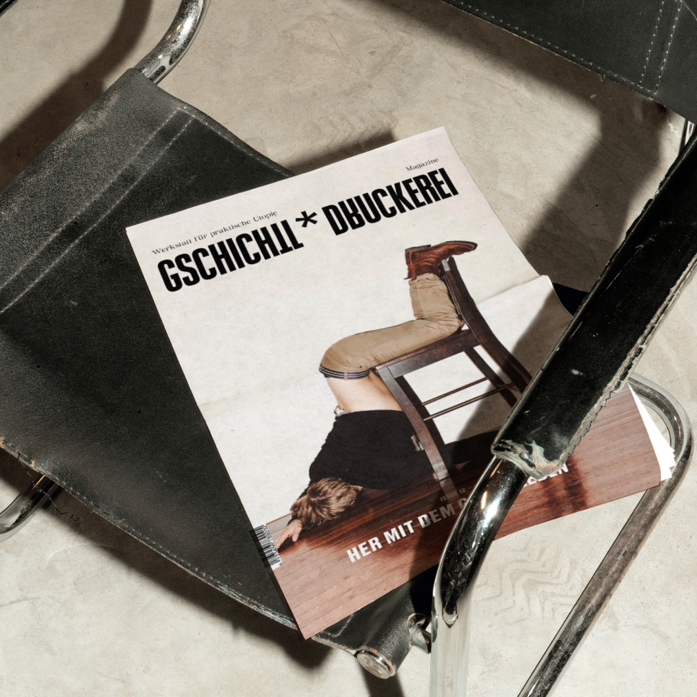
Gschichtldruckerei* is a Viennese writing collective that places diversity, inclusion and social change at the centre. For the 12th issue "Bring on the Good Life" we developed the visual identity and editorial design.

Context
The brief called for a design system that separates two very different content areas while still conveying a shared attitude. The logo needed to feel modern and at the same time make the project's dual structure visible.
Strategie & Prozess
How can practice and theory be designed as two distinct parts that clearly differ – and yet form a cohesive whole?
Design & Outcome
The 12th issue was conceived as a flipbook: vivid orange marks the practical section, deep blue the theoretical one. Two colours, two perspectives – united in a single medium. The logo places the gender asterisk* at the centre: a powerful symbol of diversity and openness. Clean, contemporary typography conveys energy, dynamism and modernity.